REFLECTION & TAKEAWAYS
The project challenged me to balance bold aesthetics with UX clarity-pushing me to refine my design instincts and prioritize strategic storytelling. I learned the importance of anchoring visual expression in user behavior, not just brand identity. By working mobile-first, I gained a deeper understanding of constraint-driven creativity and conversion-focused design. Next time, I'd expand into responsive tablet and desktop views to build a fully adaptive experience.
REFLECTION & TAKEAWAYS
The project challenged me to balance bold aesthetics with UX clarity-pushing me to refine my design instincts and prioritize strategic storytelling. I learned the importance of anchoring visual expression in user behavior, not just brand identity. By working mobile-first, I gained a deeper understanding of constraint-driven creativity and focused design. Next time, I'd expand into responsive tablet and desktop views to build a fully adaptive experience
REFLECTION & TAKEAWAYS
The project challenged me to balance bold aesthetics with UX clarity-pushing me to refine my design instincts and prioritize strategic storytelling. I learned the importance of anchoring visual expression in user behavior, not just brand identity. By working mobile-first, I gained a deeper understanding of constraint-driven creativity and conversion-focused design. Next time, I'd expand into responsive tablet and desktop views to build a fully adaptive experience.
The Challenge
The original Kiki Mason brand lacked cohesion, usability, and clarity.
While the style was bold and expressive, the site didn't support a seamless user experience. Visual inconsistencies across desktop and mobile, unclear product flows, and a lack of brand structure created confusion. The challenge was to reimagine Kiki Mason from the inside out- not just as a visual makeover, but a full UX rebrand grounded in emotional clarity, strategic design, and inclusive storytelling.
The Challenge
The original Kiki Mason brand lacked cohesion, usability, and clarity.While the style was bold and expressive, the site didn't support a seamless user experience. Visual inconsistencies across desktop and mobile, unclear product flows, and a lack of brand structure created confusion. The challenge was to reimagine Kiki Mason from the inside out- not just as a visual makeover, but a full UX rebrand grounded in emotional clarity, strategic design, and inclusive storytelling.
The Challenge
The original Kiki Mason brand lacked cohesion, usability, and clarity.
While the style was bold and expressive, the site didn't support a seamless user experience. Visual inconsistencies across desktop and mobile, unclear product flows, and a lack of brand structure created confusion. The challenge was to reimagine Kiki Mason from the inside out- not just as a visual makeover, but a full UX rebrand grounded in emotional clarity, strategic design, and inclusive storytelling.
Discovery & Research
Before designing, I audited the original site through both user and business lenses. I uncovered customer pain points, navigation friction, and missed opportunities for storytelling. Without access to real analytics, I created simulated heat maps and imagined user feedback to guide smarter decisions. These insights helped define UX priorities and unlock a clearer, bolder brand experience
Users focused attention on bold typography, movement
(angled images), and high-contrast CTAs, while
skipping over large image grids and footer links.
Key Insights Summary:
Cold Zones (Low Engagement Areas):
Banner Carousel:
Movement=interaction (users likely pause and explore)
Hot Spots (High Attention Areas):
Top Hero Section:
Large bold logo and angled models (high value interest)

To simulate real-world interaction, I created a hypothetical heat map based on common user behaviors for fashion retail sites.
Heat Maps & User Testing
Main Shop Buttons:
"Shop Men/Women/Unisex" these naturally attract clicks.
Footer:
Low attention on legal links and subscriptions
unless CTA is strong.
Long Scrolling Product Rows: Users skim quickly
past static sections.
Users focused attention on bold typography, movement (angled images), and high-contrast CTAs, while skipping over large image grids and footer links.
Key Insights Summary:
Cold Zones (Low Engagement Areas):
Banner Carousel:
Movement=interaction (users likely pause
and explore)
Hot Spots (High Attention Areas):
Top Hero Section:
Large bold logo and angled models (high value interest)
To simulate real-world interaction, I created a hypothetical heat map based on common user behaviors for fashion retail sites.
Heat Maps & User Testing
Long Scrolling Product Rows: Users skim quickly past static sections.
Main Shop Buttons:
"Shop Men/Women/Unisex" these
naturally attract clicks.
Footer:
Low attention on legal links and
subscriptions unless CTA is strong.
Users focused attention on bold typography, movement (angled images), and high-contrast CTAs, while skipping over large image grids and footer links.
Key Insight Summary:
Cold Zones (Low Engagement Areas):
Hot Spots (High Attention Areas):
Top Hero Section:
Large bold logo and angled models (high value interest)
To simulate real-world interaction, I created a hypothetical heat map based on common user behaviors for fashion retail sites.
Heat Maps & User Testing
Banner Carousel:
Movement=interaction (users likely pause and explore)
Main Shop Buttons:
"Shop Men/Women/Unisex" these naturally attract clicks.
Long Scrolling Product Rows: Users skim quickly past static sections.
Footer:
Low attention on legal links and subscriptions unless CTA is strong.
I started with low-fidelity wireframes to untangle the chaos. My focus? Cleaner flows, sharper hierarchy, and a homepage that didn't scream "template." I mapped out key screens to simplify navigation and highlight product categories that were previously buried. With each iteration, I refined the layout using usability principles and visual balance-transforming rough sketches into a confident, cohesive design.
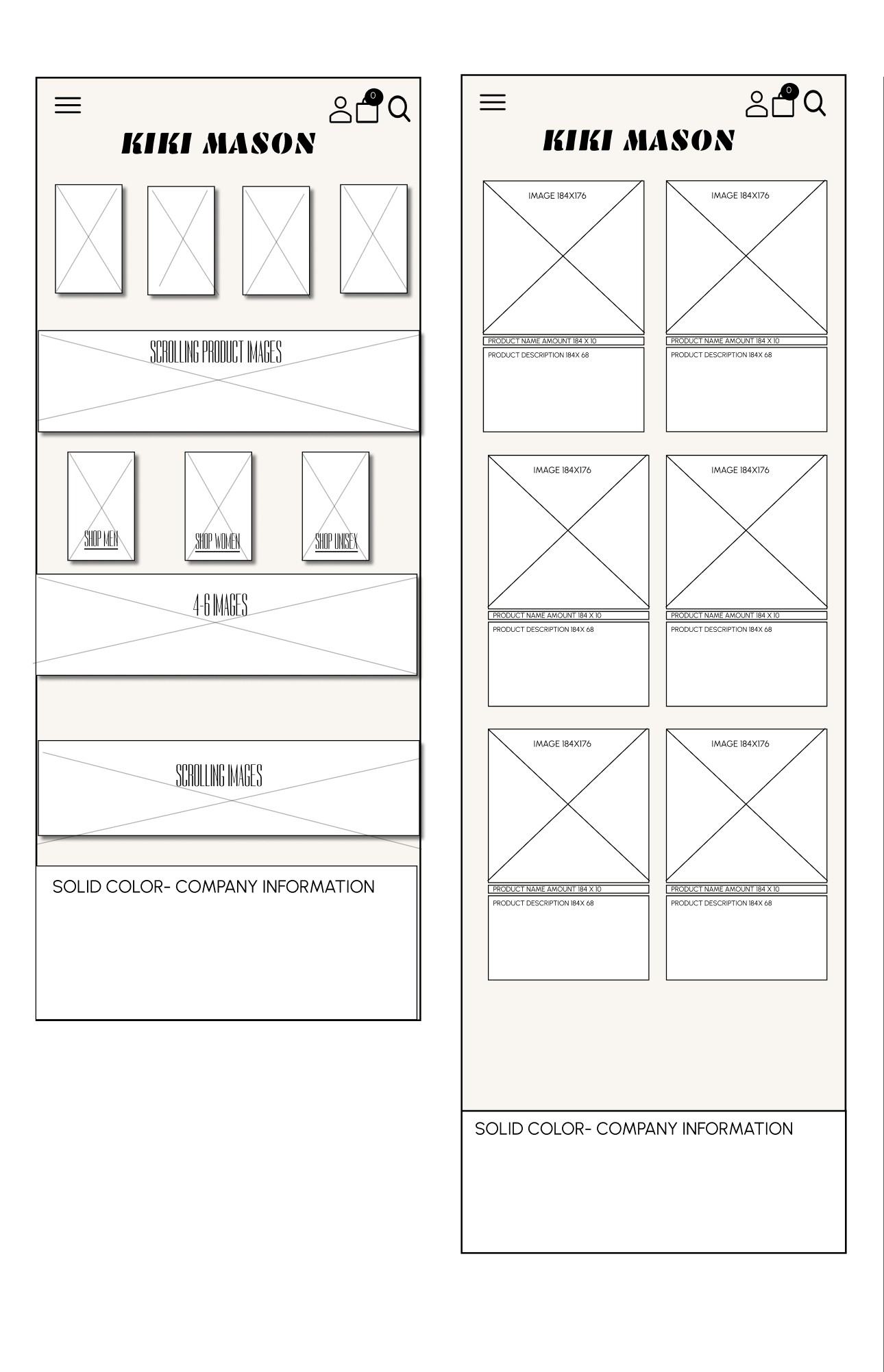
Low-Fidelity Wireframes & Iteration
I started with low-fidelity wireframes to untangle the chaos. My focus? Cleaner flows, sharper hierarchy, and a homepage that didn't scream "template." I mapped out key screens to simplify navigation and highlight product categories that were previously buried. With each iteration, I refined the layout using usability principles and visual balance-transforming rough sketches into a confident, cohesive design.
Low-Fidelity Wireframes & Iteration
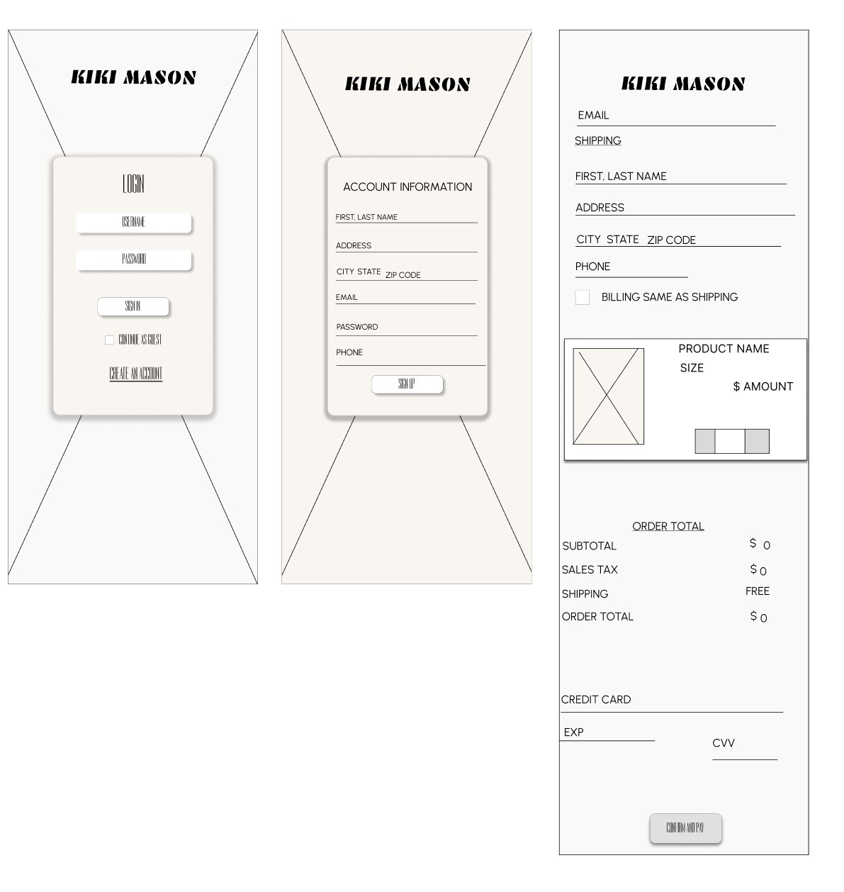
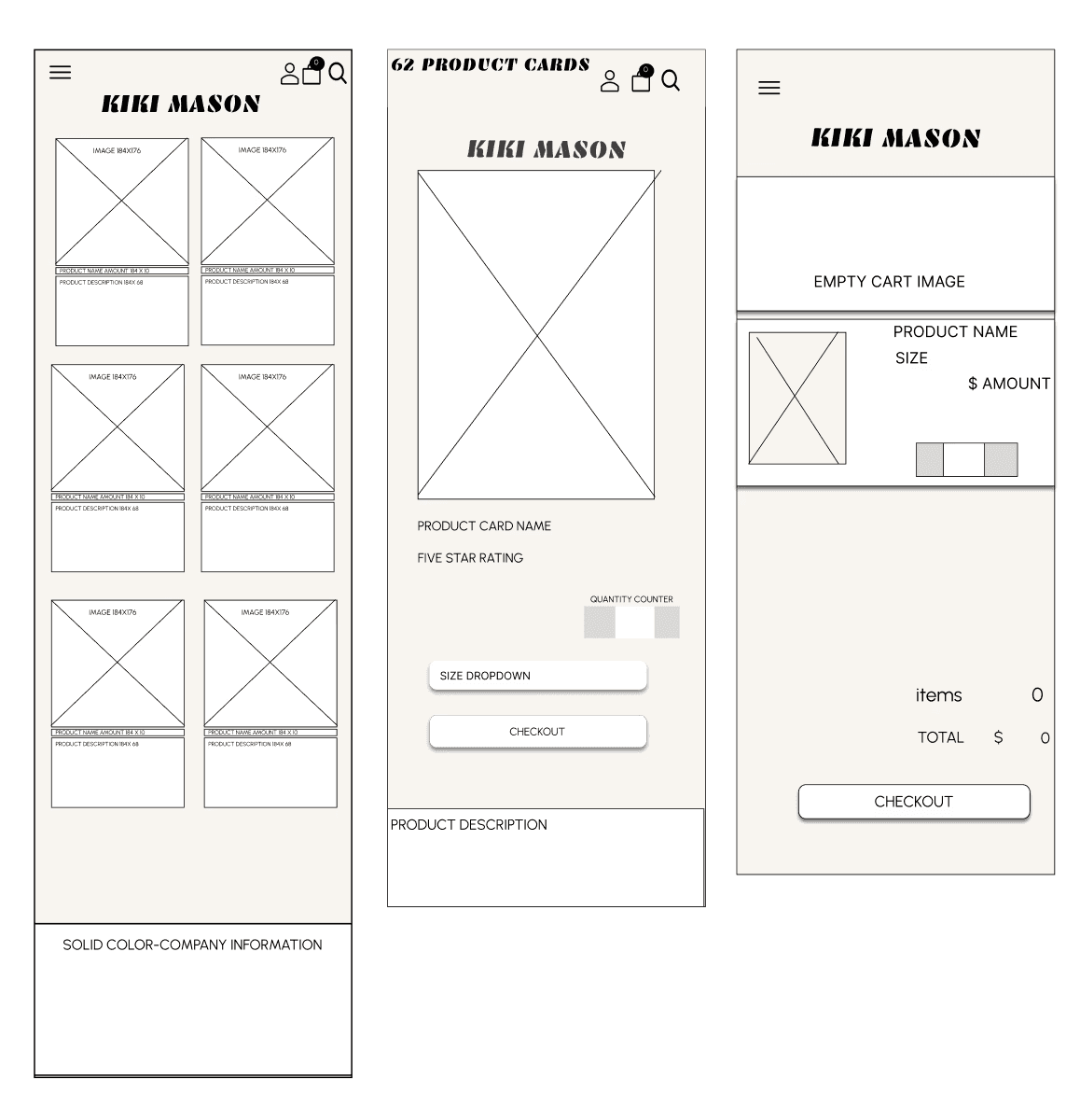
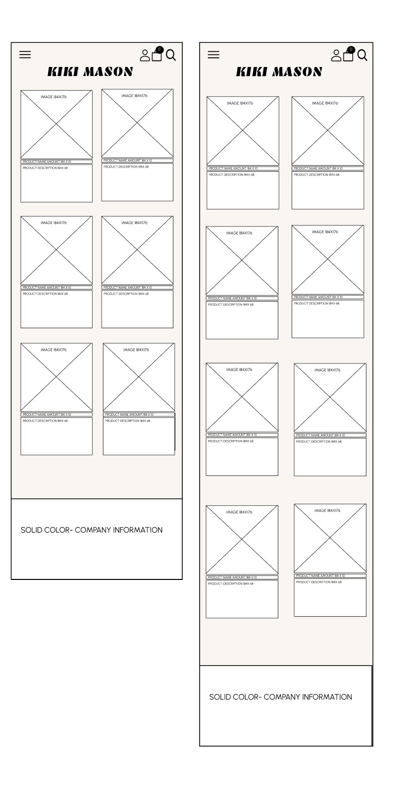
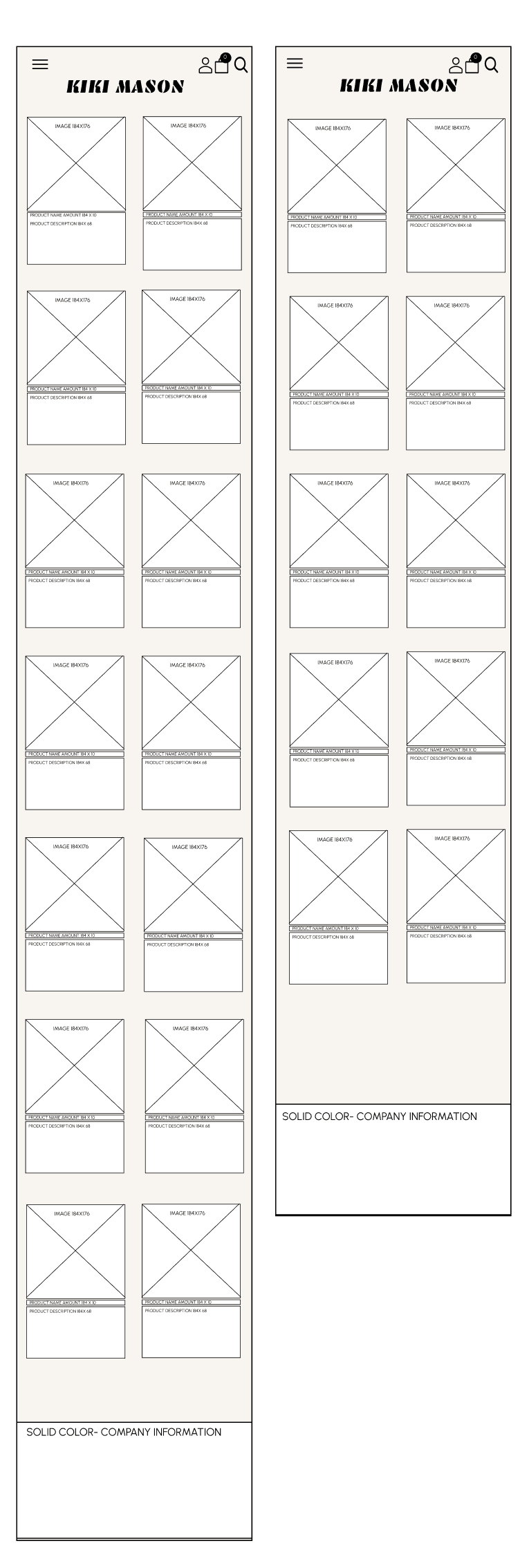
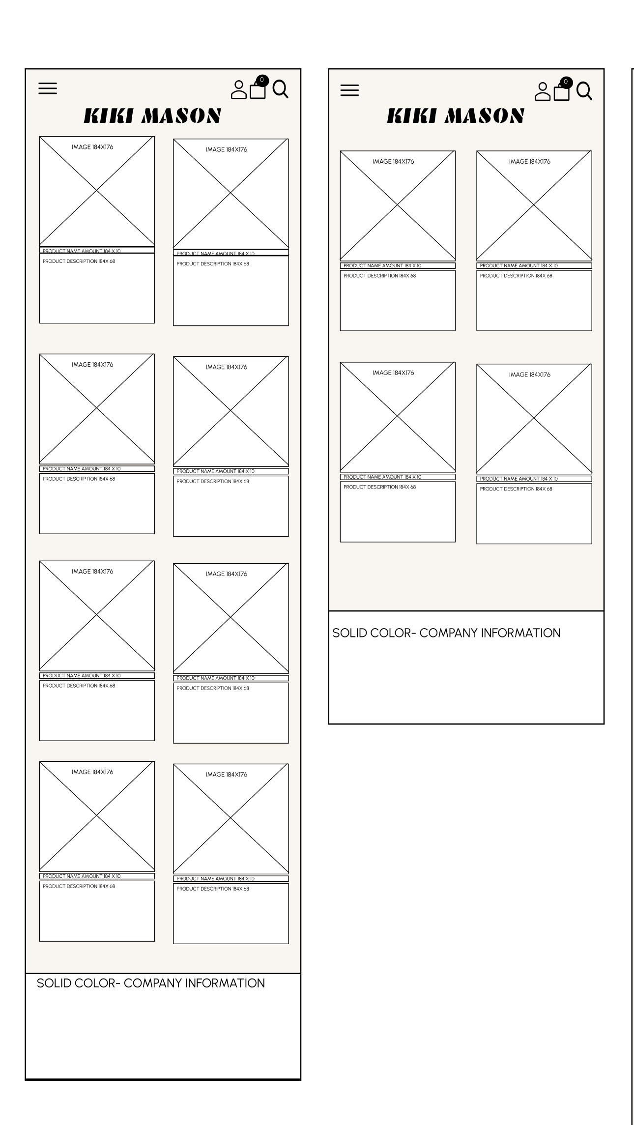
HIGH-FIDELITY WIREFRAMES
I transitioned from wireframes to a high-fidelity design that reflects the brand's playful, clean aesthetic. Every element was crafted to support intuitive navigation, highlight key products, and reinforce brand personality. Layout spacing, visual hierarchy, and type choices were refined to feel intentional and shoppable. The result? A layout that feels custom and true to the brand's personality
PLAY
Clean, scroll-first design made for mobile shoppers
Type hierarchy emphasizes product categories
Custom image blocks to highlight diversity and inclusivity
Focused on conversion with quick path to cart
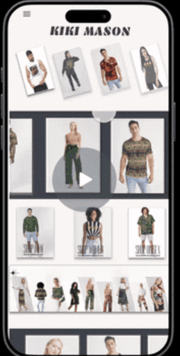
Mobile-First Focus
With Kiki Mason's primary audience shopping on mobile, I focused on designing a high-fidelity mobile experience first. This approach ensured smooth navigation, intuitive tap targets, and fast-loading visuals tailored to thumb
friendly behavior. The layout and user flow were refined to prioritize clarity, product visibility, and brand personality. Future iterations would adapt this systems for tablet and desktop, expanding layout flexibility while preserving the same seamless experience.
High-Fidelity Wireframes
I transitioned from wireframes to a high-fidelity design that reflects the brand's playful, clean aesthetic. Every element was crafted to support intuitive navigation, highlight key products, and reinforce brand personality. Layout spacing, visual hierarchy, and type choices were refined to feel intentional and shoppable. The result? A layout that feels custom and true to the brand's personality
PLAY
Clean, scroll-first
design made for mobile shoppers
Type hierarchy
emphasizes
product categories
Custom image blocks to highlight diversity
and inclusivity
Focused on conversion
with path to cart
Mobile-First Focus
With Kiki mason's primary audience shopping on mobile, I focused on designing a high-fidelity mobile experience first. This approach ensured smooth navigation, intuitive tap targets,
and fast-loading visuals tailored to thumb friendly behavior. The layout and user flow were refined to prioritize clarity, product visibility, and brand personality. Future iterations would adapt this systems for tablet and desktop, expanding layout flexibility while preserving the same seamless experience.
HIGH-FIDELITY WIREFRAMES
I transitioned from wireframes to a high-fidelity design that reflects the brand's playful, clean aesthetic. Every element was crafted to support intuitive navigation, highlight key products, and reinforce brand personality. Layout spacing, visual hierarchy, and type choices were refined to feel intentional and shoppable. The result? A layout that feels custom and true to Kiki Mason
PLAY
Clean, scroll-first design made for mobile shoppers
Type hierarchy emphasizes product categories
Custom image blocks to highlight diversity andinclusivity
Focused on conversion with quick path to cart
Mobile-First Focus
With Kiki mason's primary audience shopping on mobile, I focused on designing a high-fidelity mobile experience first. This approach ensured smooth navigation, intuitive tap targets, and fast-loading visuals tailored to thumb friendly behavior. The layout and user flow were refined to prioritize clarity, product visibility, and brand personality. Future iterations would adapt this systems for tablet and desktop, expanding layout flexibility while preserving the same seamless experience.
OUTCOME
The redesigned Kiki Mason site delivered a clearer, bolder experience that aligned with the brand's expressive identity. By simplifying navigation and emphasizing mobile-first usability, the new design created a frictionless path from product discovery to checkout. Strategic hierarchy and visual storytelling boosted engagement across key product categories. The result? A high-fidelity experience that actually feels as custom and confident as the brand itself.

REBRANDED
Kiki Mason is a fashion brand built for the beautiful, confident, and unapologetically different. I redesigned the full brand experience-from logo and type to product page flow, homepage layouts, and bold, sassy copy. The goal was to fuse fierce aesthetics with intuitive UX, creating a cohesive system that feels as confident as it looks.
OUTCOME
The redesigned Kiki Mason site delivered a clearer, bolder showing experience that aligned with the brand's expressive identity. By simplifying navigation
and emphasizing mobile-first usability, the new design created a frictionless path from product discovery to checkout. Strategic hierarchy and visual storytelling
boosted engagement across key product categories. The result? A high-fidelity experience that actually feels as custom and confident as the brand itself.